Typography is something very important to designer. Once you want to become a designer, you had better learn and know how to use it creatively!
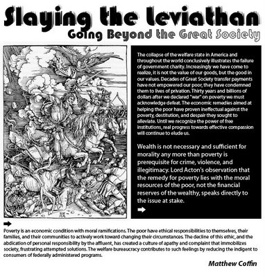
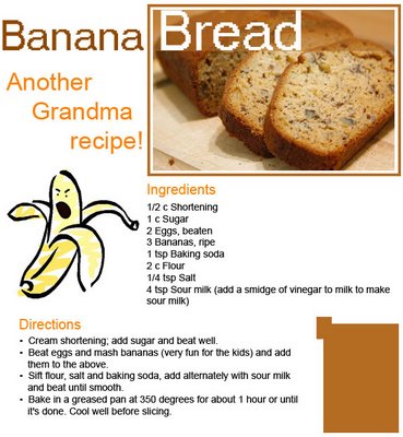
This image is about an cruel, terrible massarce in the past. Once you look at this image, it's just like reading a chapter of story in a book by using black and white color. I think it will make the article itself less painfull in that way. Gimme your ideas about this ^.^! And the next exercise: It's the formula of how to make a delicious banana bread. This image look like a menu in a restaurant. And I think once I used those fonts, it can add more interest to you all. So, come on, what are you waiting for, enjoy making it by yourselves and send it to your buddies!

This image is about an cruel, terrible massarce in the past. Once you look at this image, it's just like reading a chapter of story in a book by using black and white color. I think it will make the article itself less painfull in that way. Gimme your ideas about this ^.^!
 And the next exercise: It's the formula of how to make a delicious banana bread. This image look like a menu in a restaurant. And I think once I used those fonts, it can add more interest to you all. So, come on, what are you waiting for, enjoy making it by yourselves and send it to your buddies!


2 Comments:
Nhận xét này đã bị quản trị viên blog xóa.
You've used a nice grid for you layout and have paid attention to the alignment of your elements.
Your spacing feels a bit cramped. There should be a bit more space between the Headline and the subheading. Also more space between body and the top title section. How come the text in you the black box is of 2 different sizes? You have not included a pull-quote. Does the article continue on another page? Why have you included arrows? The text is a bit small to read here.
In your recipe layout, the choice of colors work really well. The image o f the illustrated banana is a nice touch except that its facial expression is not that welcoming. Your font choice for "Banana Bread" is a bit pixelated and feels very digital and sterile, instead of inviting.
How come you have a brown square in the lower right hand corner? What purpose does it serve?
Đăng nhận xét
<< Home